
In the digital age, where information is constantly consumed, the need for effective visual communication has never been more crucial. One powerful tool that has emerged to meet this demand is the infographic maker. These visually compelling graphics allow for the quick and easy comparison of data, making complex information digestible for a wide audience.
In this blog, we explore the art of designing color schemes for comparison infographic templates. Delving into the significance of color choices in visual communication, we discuss how contrasting hues highlight differences and harmonious blends enhance clarity. From the psychology of color to practical design tips, join us for insights into creating impactful infographics tailored for meaningful comparisons.
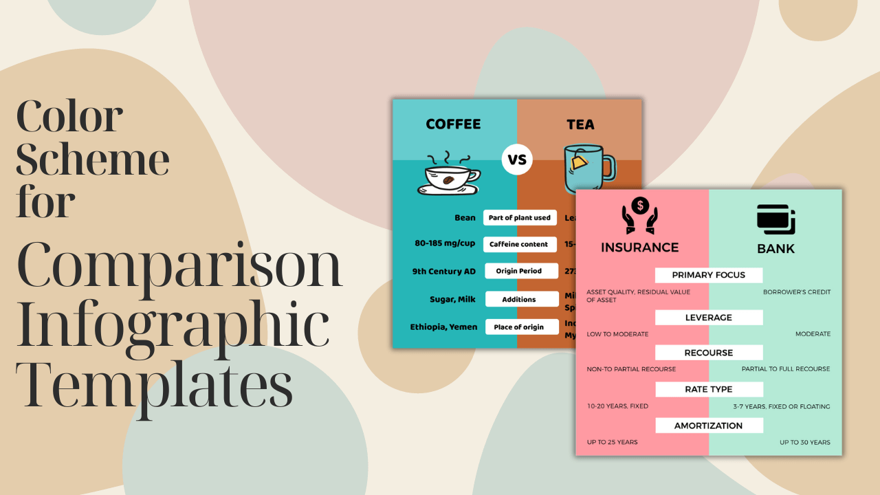
Tips for Design Color Scheme for Comparison Infographics
Understanding Color Psychology
Colors play a profound role in human psychology, influencing emotions, perceptions, and behavior. Harnessing the psychology of colors is fundamental to the success of any visual content, and comparison infographics are no exception. Before delving into design strategies, it’s essential to understand the emotional impact each color can have on the audience.
Basics of Infographic Design
Creating a successful comparison infographic starts with mastering the basics of infographic design. Clarity, simplicity, and effective storytelling are the cornerstones of impactful visuals. Whether it’s a side-by-side product comparison or a statistical analysis, the design should facilitate easy understanding.
The Power of Visual Comparison
Comparison infographics leverage the innate human ability to process visual information rapidly. By presenting data in a visually comparative format, these infographics enable viewers to grasp complex concepts quickly. Examining successful examples illustrates the potential impact of a well-crafted visual comparison.
Choosing the Right Color Scheme
The choice of colors in an infographic is more than an aesthetic decision; it’s a strategic one. Factors such as the target audience, the nature of the data, and the intended message all influence color selection. To ensure impact, one must carefully consider the color scheme’s alignment with the infographic’s purpose.
Contrast and Readability
Effective color contrast is pivotal to the readability of comparison infographics. The juxtaposition of light and dark hues enhances visibility and ensures that the information is easily discernible. Strategies for achieving optimal contrast contribute to a more engaging and user-friendly experience.
Color Harmony
While contrast is crucial, achieving a harmonious overall color scheme is equally important. Different color harmonies, such as complementary or analogous, can evoke specific emotions and enhance the overall aesthetic appeal. Striking the right balance ensures that the infographic is visually pleasing without sacrificing clarity.
Tools for Designing Infographics
The market offers a plethora of tools designed specifically for creating infographics. From user-friendly online platforms to advanced graphic design software, choosing the right tool is essential. Familiarizing oneself with these tools and their features maximizes the potential for creating visually stunning and effective comparison infographics.
Accessibility Considerations
In the pursuit of a visually striking infographic, accessibility should not be overlooked. Addressing color-related accessibility issues ensures that the infographic is inclusive and can be understood by a diverse audience. Choosing color combinations that are accessible to individuals with color vision deficiencies is a step towards creating universally understandable visuals.
Testing and Iteration
The design process is an iterative one. Testing different color schemes and gathering feedback is crucial for refining and enhancing the infographic’s effectiveness. A willingness to adapt and iterate based on user engagement ensures that the final product resonates with the target audience.
Case Studies
Examining real-world case studies provides valuable insights into the practical application of color scheme strategies. Successful examples showcase how thoughtful color choices contribute to the overall impact of the comparison infographic. Analyzing these case studies offers inspiration and practical lessons for designers.
Trends in Color Usage
Design trends are ever-evolving, and staying abreast of current color usage trends is essential. From bold and vibrant palettes to more subdued and minimalist choices, understanding the prevailing design preferences informs the creation of relevant and impactful comparison infographics.
Common Mistakes to Avoid
Even with the best intentions, designers may fall prey to common mistakes that can undermine the effectiveness of a comparison infographic. Identifying and avoiding pitfalls such as color overload or poor contrast ensures that the visual communication remains clear and impactful.
Future of Color in Infographics
As design preferences and technology evolve, so too will the use of color in infographics. Anticipating future trends allows designers to stay ahead of the curve and create visuals that not only meet current expectations but also remain relevant in the future.
Conclusion
In conclusion, the design of impactful comparison infographics hinges on strategic color scheme choices. Understanding the psychology of colors, mastering the basics of infographic design, and embracing the power of visual comparison are all critical components. By carefully selecting and harmonizing colors, considering accessibility, and learning from case studies, designers can create infographics that captivate and inform.